How to Use Color Visualization Tools for Your Next Project | Moya’s Painting Kansas City
Discover how to use color visualization tools to plan your perfect painting project with expert advice from Moya’s Painting, serving Kansas City and beyond.
HOME IMPROVEMENTRESIDENTIALINTERIOR PAINTINGEXTERIOR PAINTING
Johnny Moya
4/28/20255 min read

Introduction
Choosing the right colors for a painting project, whether it’s your home exterior, interior spaces, or even a commercial building, can feel overwhelming without the right tools. Visualization technology has transformed the way we approach color selection, allowing homeowners to see the final outcome before the first drop of paint is applied. In a world where first impressions matter, getting the colors just right is essential.
At Moya’s Painting, proudly serving Kansas City, Lee’s Summit, Overland Park, Gladstone, and North Kansas City, we integrate cutting-edge color visualization techniques into our services. By doing so, we empower clients to feel confident in their choices and ensure that their homes or businesses achieve the aesthetic appeal they envision.
What Are Color Visualization Tools?
Color visualization tools are innovative digital platforms that simulate how different colors will appear when applied to walls, exteriors, or furniture. These tools are designed to take the guesswork out of color selection by providing a realistic preview based on actual photos of your home or a model environment.
By simply uploading an image of the space you plan to paint, you can digitally “paint” walls, trim, doors, and even landscaping elements to see how different hues interact. These tools also assist in building coordinated palettes, helping you select complementary colors that enhance the overall look. Apps such as Sherwin-Williams ColorSnap®, Benjamin Moore’s Color Portfolio™, and the Home Depot ProjectColor™ are all popular options among homeowners and painting professionals alike.
While technology offers convenience, Moya’s Painting reminds clients that digital simulations should always be complemented by real-world color samples to account for lighting and texture differences.


The First Steps Toward a Flawless Visualization
Starting your visualization journey requires thoughtful preparation. First, capture clear, high-resolution images of the area you want to update. Outdoor shots should be taken at different times of day to account for changing light conditions, while indoor photos should minimize artificial lighting distortions.
Once you have your image, upload it to your chosen app and begin experimenting. Focus initially on broad categories—do you prefer cool tones, warm tones, or neutral hues? Then, drill down into more specific shades. Testing small areas with contrasting colors helps you understand how elements like trim and accent features will appear alongside the main color.
Moya’s Painting suggests clients in North Kansas City and Lee’s Summit focus on how colors look in real conditions rather than relying purely on how they appear on a screen. Proper visualization is the first key step toward achieving a harmonious, timeless look.
Mistakes to Avoid When Using Visualization Tools
Color visualization tools are fantastic, but they’re not foolproof. A common mistake is choosing colors based purely on digital previews without accounting for real-world variables like lighting, surface texture, and sheen. Glossy finishes reflect more light, changing how a color looks, while matte finishes can deepen a shade’s appearance.
Another error is overcomplicating the color scheme. Some homeowners get carried away with mixing too many tones, which can lead to a chaotic and visually overwhelming result. At Moya’s Painting, we advise sticking to a cohesive palette where no more than three primary colors dominate: a base, a trim, and an accent color. This classic balance creates visual harmony without sacrificing personality.
Finally, always remember that not all screens are created equal. Colors may look different on your phone, tablet, or desktop monitor, so always test physical samples before making your final decision.
Expert Strategies for Choosing the Right Colors
While visualization tools offer endless possibilities, expertise helps refine them into smart, lasting choices. Start by considering your home’s architectural style and surrounding environment. Traditional homes often pair best with classic colors like navy, burgundy, or forest green, while modern builds shine in crisp whites, charcoals, and bold color blocks.
Also, think about the emotional impact of color. Cool tones like blue and green can evoke calmness, ideal for residential homes. Warm tones like yellow and terracotta feel inviting and lively, perfect for creating a welcoming curb appeal.
Accessibility should not be overlooked. High-contrast color schemes are not only striking but also inclusive, helping those with visual impairments better navigate and enjoy your space. Moya’s Painting always encourages Kansas City homeowners to think about both beauty and functionality when selecting their final palette.


Real Client Story: Visualizing a Dream Come True in Overland Park
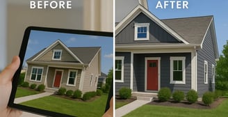
One of our favorite projects involved a family in Overland Park who wanted to update their dated tan exterior to something more contemporary. Using a visualization tool, they tested different shades and finally decided on a beautiful, bold deep gray with sharp white trim and a vibrant red door.
By visualizing their options first, they avoided second-guessing and gained confidence in their decision. Once Moya’s Painting brought the vision to life, the transformation was breathtaking—and the property value increased notably, much to the client’s delight.
The project highlights the transformative power of visualization combined with professional painting services, providing a clear example of how planning leads to flawless execution.
Maintaining Your Painted Surfaces Post-Project
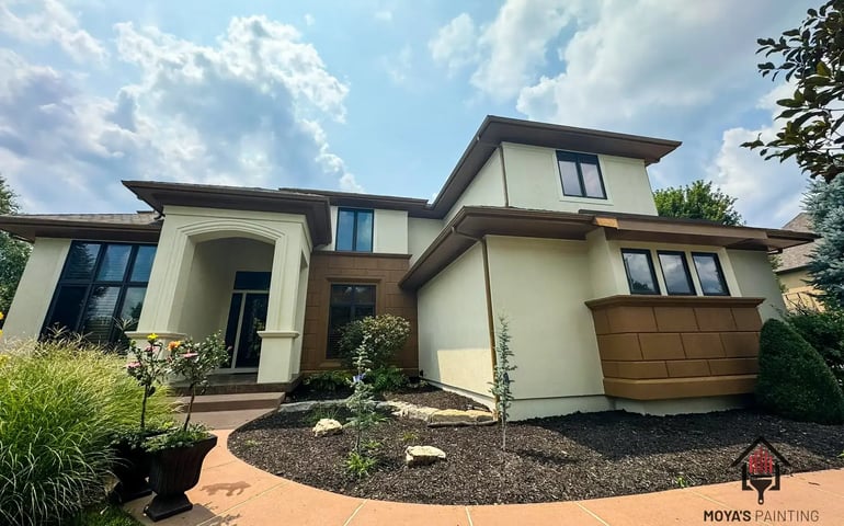
Even the perfect color scheme won’t last forever without proper care. Maintenance is crucial to preserving the vibrancy and finish of your painted surfaces, whether inside or out. Homeowners should regularly inspect for signs of wear, wash surfaces gently when dirt accumulates, and touch up small chips before they expand into larger issues.
Seasonal changes in places like Kansas City can cause expansion and contraction in siding materials, leading to cracks or fading. Scheduling a professional inspection every few years ensures your investment stays beautiful and protected. Moya’s Painting offers maintenance advice and services that extend the life and luster of your home’s fresh look.
FAQs
How do you use color effectively in visualization?
Choose colors that enhance clarity, provide sufficient contrast, and maintain visual hierarchy without overwhelming the viewer.
What is the golden rule of data and color visualization?
Keep it simple and clear—avoid excessive color combinations that confuse rather than communicate the message.
What is the best color scheme for accessibility?
High-contrast color schemes, avoiding problematic red-green combinations, ensure better accessibility for all audiences.
How to use color sample tools accurately?
Always test colors in real-world conditions, adjusting for natural light and surface texture before making final selections.
Conclusion
Color visualization tools have revolutionized how homeowners and businesses select colors, offering clarity and creativity at every step of the process. When paired with real-world expertise, these tools create a smoother, more rewarding experience, leading to stunning, lasting results.
At Moya’s Painting, we bring together technology, artistic sense, and decades of experience to help residents of Kansas City, Lee’s Summit, Overland Park, Gladstone, and North Kansas City achieve homes they are proud of. Ready to turn your vision into a beautiful, lasting reality? Let us guide you every step of the way.
REQUEST QUOTE
Elevate your Kansas City home with Moya’s Painting. We are here to turn your ideas into reality with unmatched expertise and dedication.
Address
1500 S Northern Blvd, Independence, MO 64052, EE. UU. POBOX 520033
